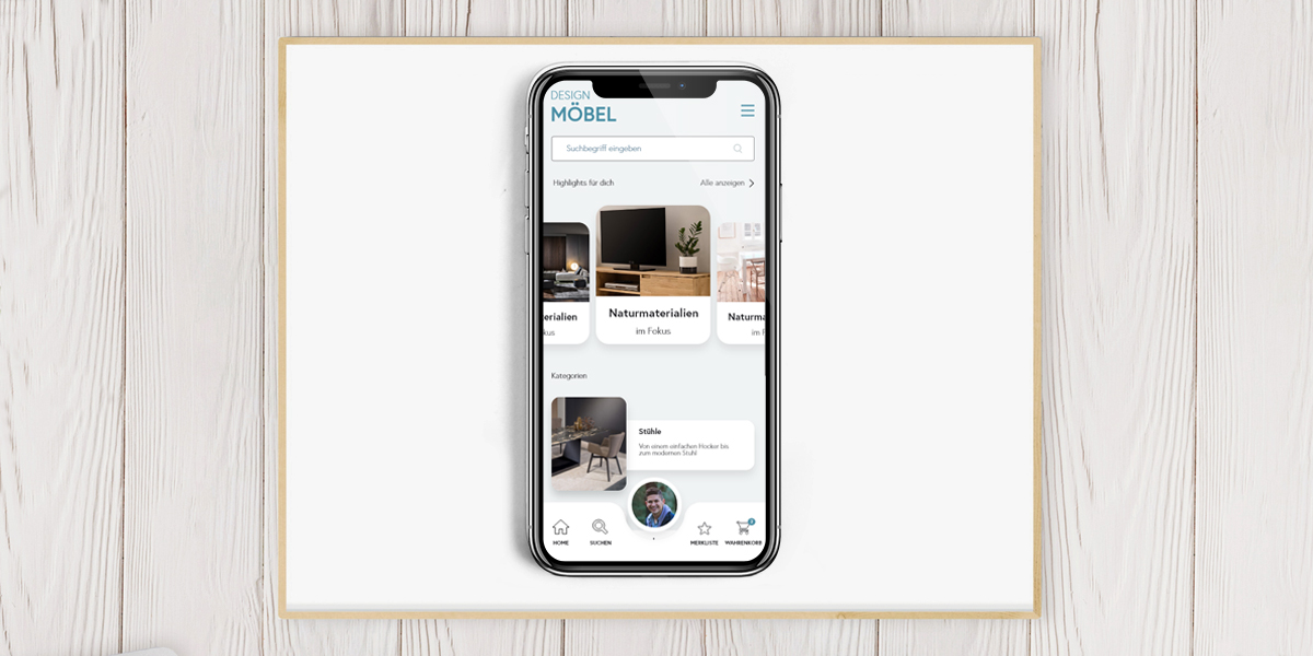
Responsive Design
Responsive web design is a design and technical paradigm for creating websites so that they can respond to characteristics of the device being used, especially smartphones
and tablet computers.
The graphic design of a "responsive" website is based on the requirements of the device used to view the website. This applies in particular to the arrangement and display of individual elements, such as
navigations, page columns and texts, but also to the use of different input methods of mouse (click, hover) or touchscreen (tap, swipe). The technical basis for this are the latest web standards HTML5, CSS3 (here in particular the media queries) and JavaScript.